|
Your
photo is the most important element in your Photo product.
To ensure high quality products, please review the following
photo recommendations.
Click to See Tips for Photo Labels
Photo Checks
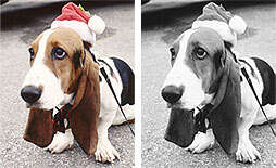
CHOOSE YOUR PHOTO CAREFULLY
The photo you place on your Photo Checks and Labels
will print in black and white. Some photos may look great
in color, but may lose detail when converted to black &
white. Consider this when selecting a photo.
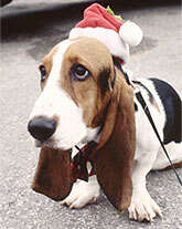
CONTENT
Please remember that the content of your photo should
be kept simple. A single center of interest will work best,
as your photo will be gray scaled and may also be screened
back. Blurry subjects and distracting backgrounds do not translate
well on Photo products.
Good Content - Preferred
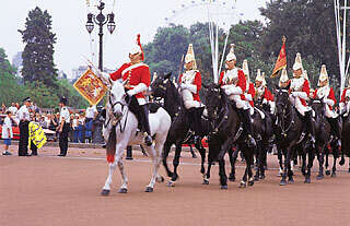
Bad Content - Not
Recommended
|
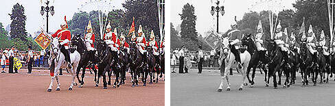
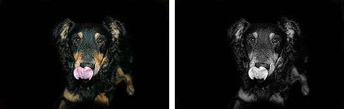
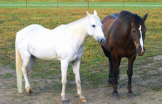
CONTRAST
It is important to be aware of contrast when selecting
the photo to use in your product. Contrast is the difference
between the lightest and darkest areas in a scene and/or photograph.
A small difference between the light and dark areas results
in a low contrasting photo, while a greater difference results
in a high contrasting photo. Photos with a high contrast traditionally
work best for Photo products
High Contrast - Preferred
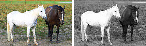
Low Contrast - Not
Recommended
|
RESOLUTION
Digital image resolution is the size of your image,
measured in pixels. Images that are higher in resolution will
result in better Photo products, while those images with a
lower resolution will appear fuzzy and indistinct.
High Resolution - Preferred

Low Resolution - Not Recommended

|
Please Note: In our efforts
to ensure a quality check product and to comply with check
processing requirements set by your bank, the photos for Photo
check products will lightened prior to production.
Photo Labels
CONTENT
Please remember the content of your photo
should be kept simple. A single center of interest will work
best. Blurry subjects and distracting backgrounds do not translate
well on Photo products.
Good Content - Preferred
Bad Content - Not
Recommended
|
CONTRAST
It is important to be aware of contrast when selecting the
photo to use in your product. Contrast is the difference between
the lightest and darkest areas in a scene and/or photograph.
A small difference between the light and dark areas results
in a low contrasting photo, while a greater difference results
in a high contrasting photo. Photos with a high contrast traditionally
work best for Photo products.
High Contrast - Preferred
Low Contrast - Not
Recommended
|
RESOLUTION
Digital image resolution is the size of your image, measured
in pixels. Images that are higher in resolution will result
in better Photo products, while those images with a lower
resolution will appear fuzzy and indistinct.
High Resolution - Preferred

Low Resolution - Not Recommended

|
|
